The tech purists might care about benchmark performance, megapixel count and screen resolution, but few consumers walk into a store spouting hardware specs when they buy a smartphone.
Instead, the majority choose the phone that fits the size of their hand, and the colour that best represents them, and ironically, the one company that knows this best is Apple, who for years focused on minimalism and even removed colours from their logo in 1998.
Today, their logo remains black (or silver, depending on how you look at it), but the company has gone back and started embracing colour in simplistic but effective ways. Those multi-coloured iMacs from the late 90s? They are now back in style with 6 pastel colours (silver makes the seventh colour but that’s not pastel) and few would walk into an Apple Store asking for a 24-inch iMac powered by the M1 processor.
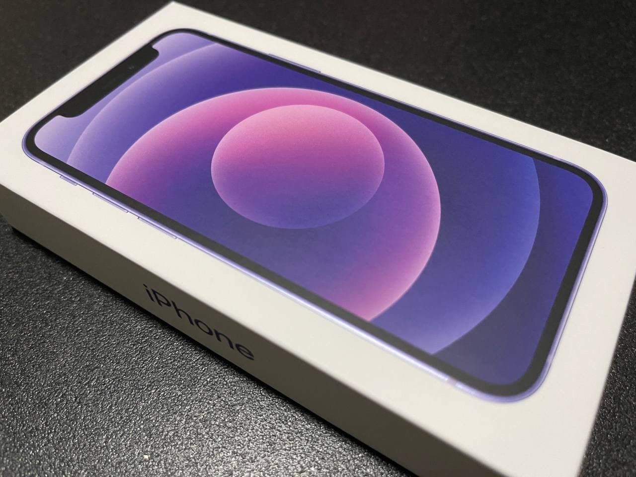
Instead, their first choice would be the colour that catches their eye. The same goes with iPhone colours. No one batted an eye when Apple announced a purple variant of last year’s popular iPhone 12 release during Wednesday’s Apple event, but there is no escaping that immense calmness that the colour provides.
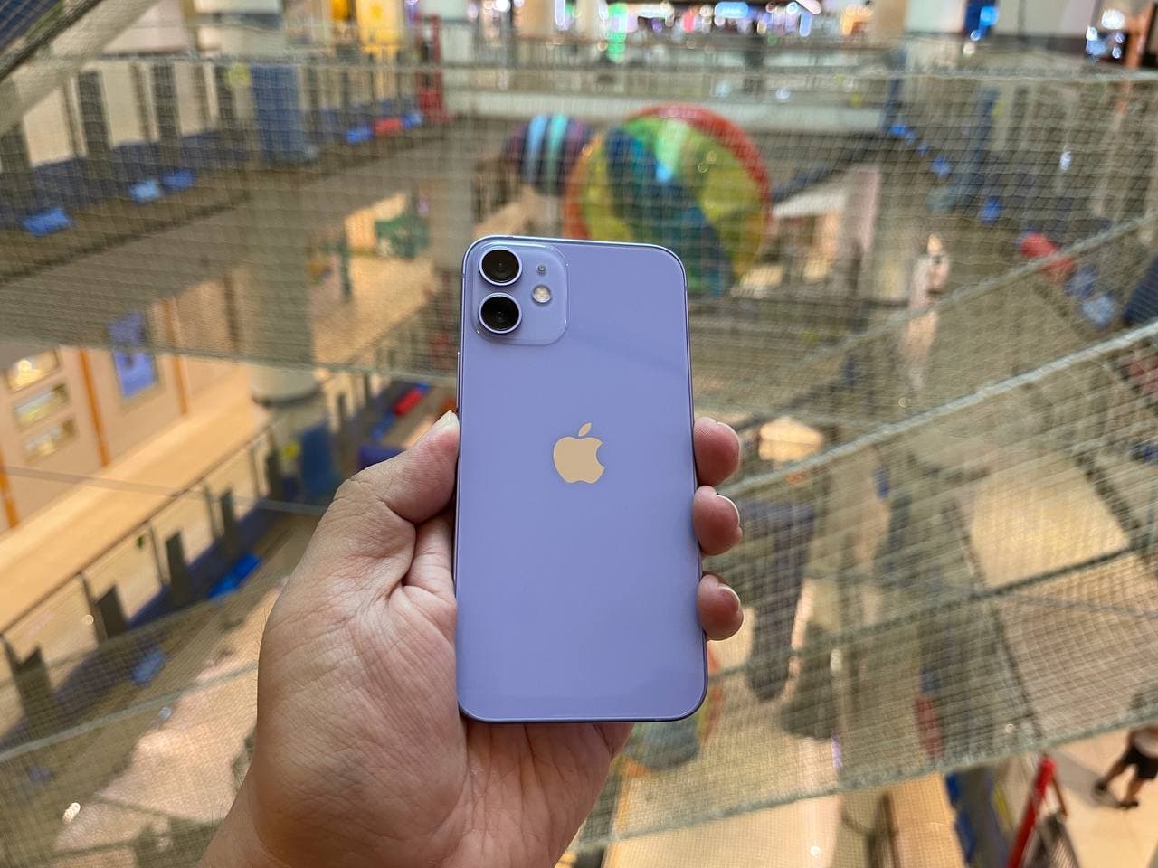
Unlike the other colours in the series – red, blue and green – purple doesn’t occur as frequently in the real world. Lilacs and orchids are slightly less intense in tone, and eggplants are too deep. The insides of a grape comes close and perhaps it is due to this infrequency that makes the new purple variant resonate.
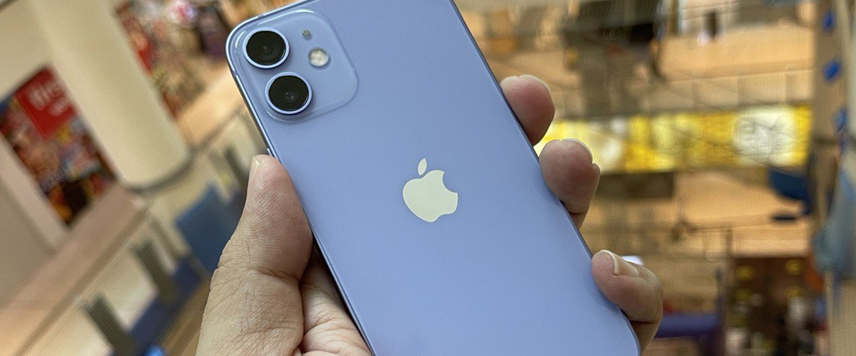
Up close, the colour is deeper in tone than what you’ve seen in photos, but that also depends on the lighting conditions of the room. Let me say it here first that the colour does not photograph as well because, under pure white light, the purple comes across as a slightly bluish hue.
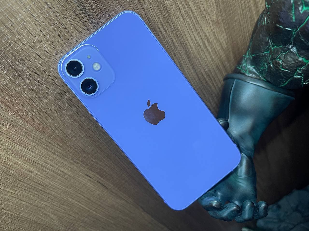
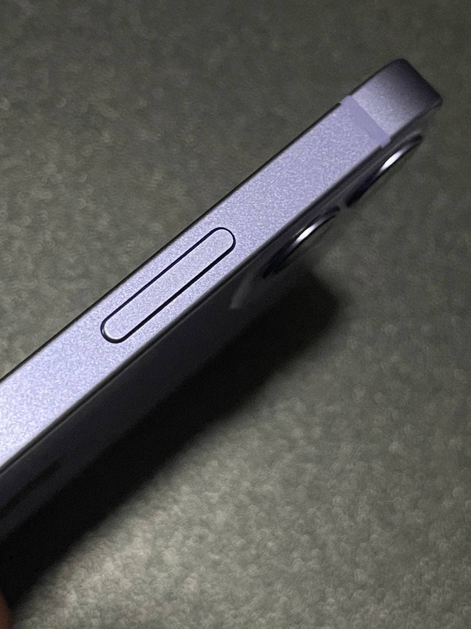
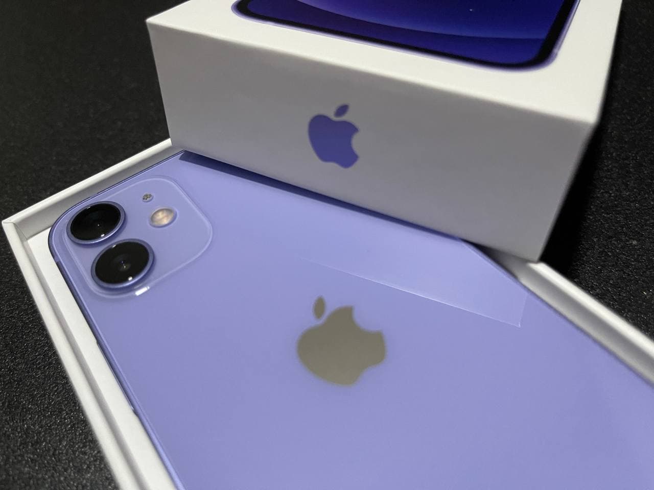
But perhaps that’s what makes it unique, that instead of just getting a change in intensity of a single colour depending on where you are, the purple colour here can give you another colour under special conditions. On the rear, the glass panel softens the purple hue as well, making it different in vibrancy, compared to the purple aluminium used on the phone’s metal side panels.
But suffice to say, in a sea of colour offerings for phones, laptops and tablets where green is more aquamarine or turquoise, and red can be crimson or burgundy, purple is a simple, efficient but extremely popular and recognizable offering. Of course, the same can be said for lavender and violet for the colour purple, but since it’s less naturally occurring, it stands out more like royalty, presenting a more regal touch.

Hsals needs more space in his house, and more money in his bank account to pay for all the toys, collectibles and other geek related items that companies are churning out. Free-time? Girlfriend? Who’s got time for those?


